I recently travelled back to my home town of Portland, Oregon and a debate quickly broke out comparing the weather between where I live now (New York City) and the Portland area. To settle the bet, quickly graphing a few seasons worth of data in R (of course!) was in order.
The Approach
The main question that needed answering was How Similar are the temperatures of Portland and New York?
Using ggplot to show the last few seasons of high and low temperatures should quickly get us a visual comparison of the two areas and allow us to draw inferences of similarity.
The Data
NOAA has a very accessible climate data repository. It’s free to use and request and the level of detail is pretty remarkable.
I ordered a data set to include daily temperature and precipitation data from 2012 to present (July 2015).
The Analysis
All the code is at the bottom of this post.
The data was ready for download in a few hours and was easily imported into R. The data was clean and very little had to be done to prepare it for graphing. For convenience, I created a temperature conversion function and reset the TMAX and TMIN columns to read in Celcius rather than tenths of degrees in Celcius.
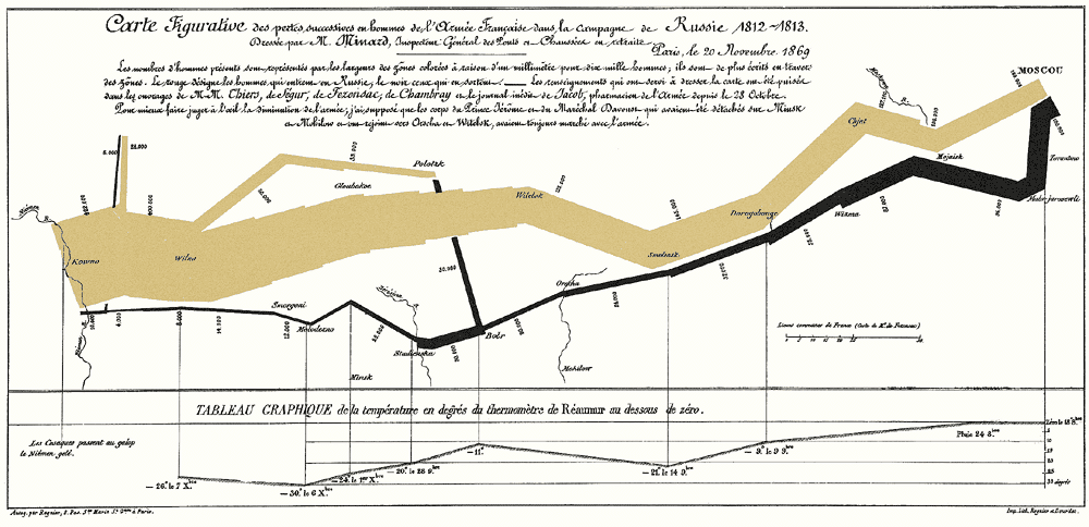
To get a good look at the daily temperatures, I used a ribbon plot. Ribbon plots are great for showing a range of trending data. It was famously used in Edward Tufte’s visual representation of Napoleon’s march to Moscow.
Since this is a visual analysis, the easiest thing to do is to graph the temperature data simultaneously and visually observe any differences. The first graph I produced was:

Blue is New York City and green is Portland Oregon.
A few observations immediately jump out:
- There is quite a bit of overlap in the temperatures of the two cities
- Portland does not get as cold in the winter
- Portland’s low temperatures in the summer are much lower than NYC but the highs are fairly similar.
- This last winter in NYC sucked. I’m pretty sure that was a scientific fact prior to this analysis.
This graph allowed us to conclude that the temperatures of the two locations are fairly similar during the spring and fall and the largest differences exist in the summer and winter (when the temperatures are highest and lowest). It seems that Portland provides respite from the heat at night while New Yorkers continue to suffer all day and night.
To confirm or reject this newfound observation, we could graph the intra-day range of the temperatures throughout the year and compare the difference of the ranges.
There’s a bit of nuance in the last statement. The range of the daily temperature is found by subtracting the day’s high from the day’s low. This produces a daily range of temperature. We can then subtract one city’s range from another to produce a comparison of each day’s temperature range. If Portland truly gets colder at night after a similar daily high temperature then the range of temperature in Portland will be higher. Subtracting Portland’s range from New York’s will produce a result much higher than 0 if Portland does indeed get cooler at night. :+1: for math!

The individual daily range is pretty noisy, but a smoother can be applied to show the general seasonal differences.
For the last three years, the temperature ranges in Portland and New York are pretty similar expcept during the summer. The difference in ranges are pretty close to zero until summer when Portland fluctuates by around 7 degrees. This year (2015) has the highest fluctuations.
Conclusion
All in all, the temperatures in New York and Portland are pretty similar. The biggest differences occur during the summer when New York refuses to cool off at night.
This was a fun chance to play around with the ribbon plot and do graphical analysis.